

Case Study
Evolve Toys Website Redesign
A Canadian e-commerce provider of educational toys based on the STEAM approach to teaching.

BRIEF
Redesign their existing website and better communicate their brand tone.
ROLE
Creative Direction
UI/UX
Website Design
CLIENT
Evolve Toys
Before getting started on the project, we sat down with the clients to define the problem with their existing website. Why were they looking to redesign their online presence? What needed fixing? There were a couple of things that they wanted to focus on:
Elevate their brand to communicate to their audience that they are a high-quality toy supplier.
Before the redesign, they had a high bounce rate due to poor user experience on the website. The aim of the redesign was to decrease bounce rate and keep prospective customers on the site for long enough to convert.
01.
Defining the Goal
02.
Research & Exploration
Site Audit
Before anything, the first thing I wanted to do was a site audit of the existing website, and complete my own analysis of what exactly the pain points were from a brand and user experience perspective.
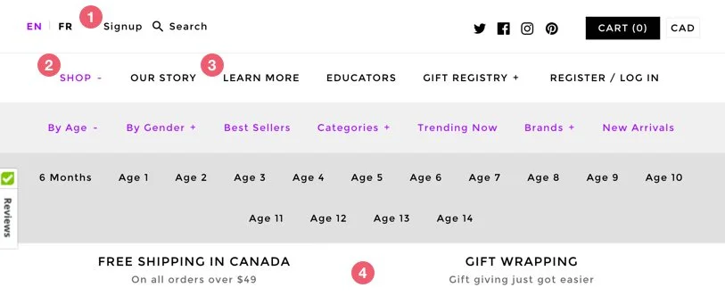
The navigation is noisy, resulting in a lack of focus.
The ‘Shop’ button forces the user to know specifically what they are shopping for, which can deter the user from the beginning from browsing the product inventory altogether.
Some navigation elements like ‘Learn more’ have no meaning - learn more what?
Free shipping and gift wrapping, although great pros for the user, take up a lot of real estate on the navigation.

Upon landing on the site, there is no introduction, easing the user into the website, resulting in the user being lost from the very beginning of the website.
Overall site lacks branding, and does not promote a ‘high-end’ look and feel, which reduces credibility.
Digging into Data
After defining what the main usability issues of the site were, with the assistance of our marketing analyst, we walked through the google analytics of the website and interpreted the findings to see which pages create the most conversion, which didn’t and why.

03.
Ideation & Wireframing
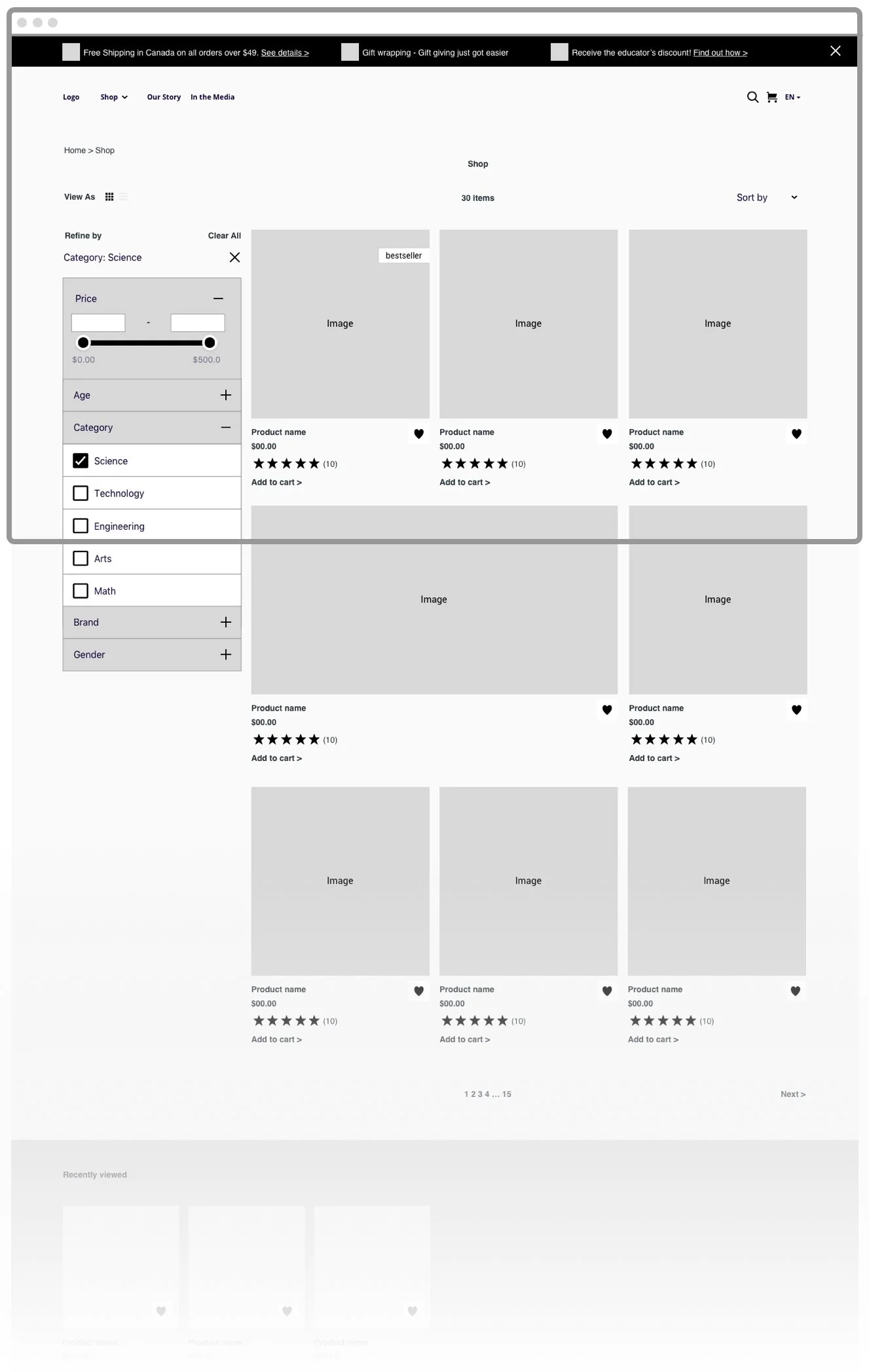
Sitemap
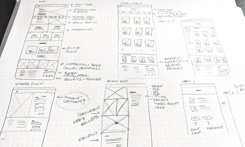
Before diving into the ideation, I created a sitemap to better understand and categorise the information on the website.

Starting with pen and paper, I explored different ways we could place the content of the various pages in a way that best told Evolve Toy’s story. I looked at how to combine content and commerce in a natural way, to reduce the friction of online shopping, and to show the user is what readily available from the get-go while simultaneously showcasing the brand itself.
04.
Designs
As it was a toy store, finding that balance between luxury and friendliness was going to be a challenge. In our initial conversation with the clients, we explored various sites and brands to gauge the direction that they wanted to go in with their brand and website.

Style Tile
Before diving deep into the designs, I shared a couple of style tiles with the clients to see if they were aligned with the look and feel presented.

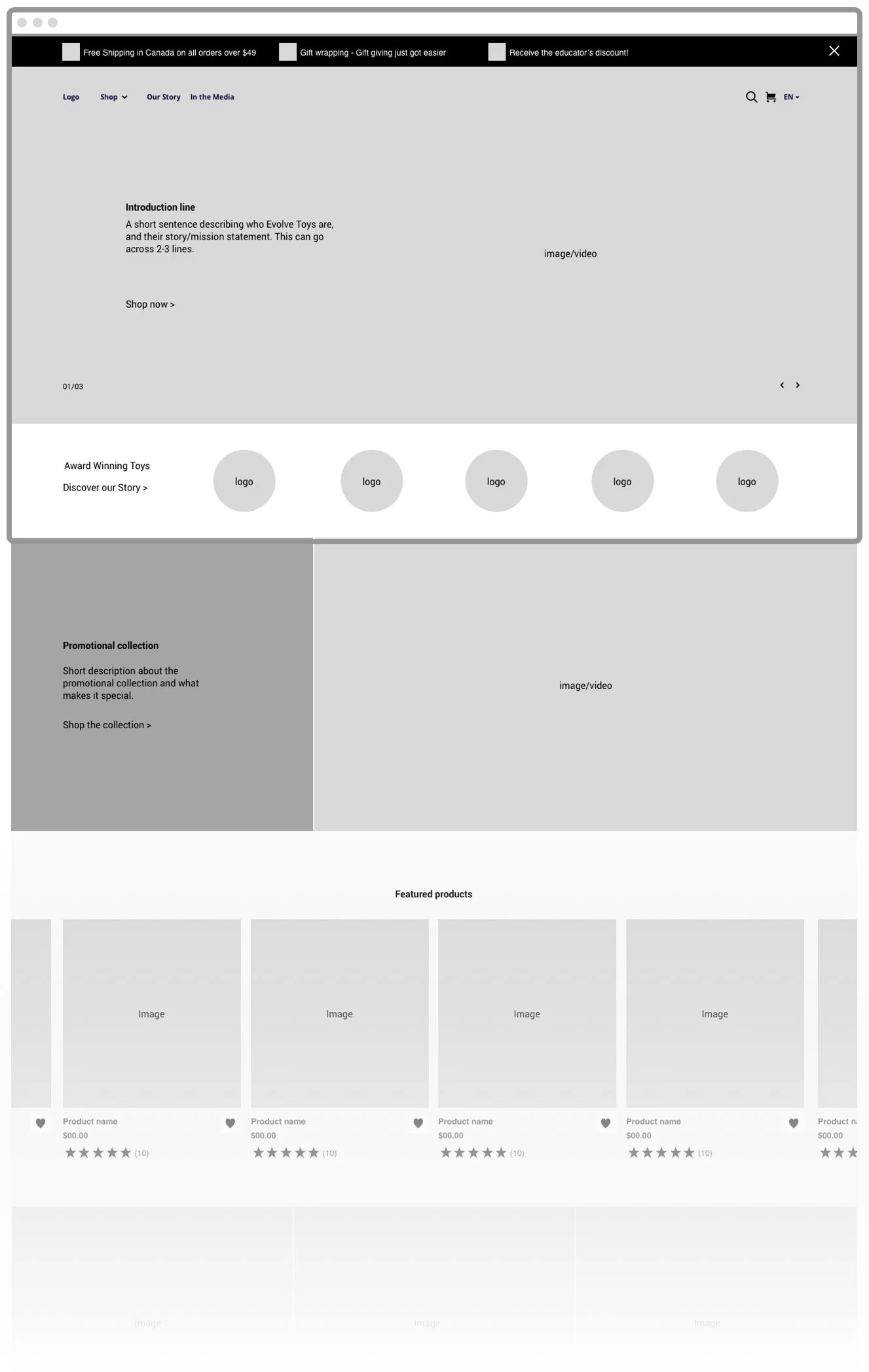
Hi-fidelity Designs
Once alignment was received visually, I transformed the lo-fi wireframes into hi-fidelity wireframes, adding all the details in, ensuring it aligned with the brand.

05.
Development Handover
After finalizing the designs, we moved into development. I sat down with the developer and discussed the design and experience of the website, offering basic prototypes to assist them in understanding the flow. I also provided documentation to ensure that the designs were accurate as possible.
Finally, we would do a QA as a team to ensure that the developed site was aligned with the final designs.